Bom
About the client
Client is an online store of heating, air conditioning, ventilation, and plumbing equipment that is actively developing its digital direction and aims to build a strong online presence in its industry. As an expert in the market, the company understood the importance of high-quality identity and a modern, functional website, so it approached us with a request for a comprehensive solution.
The team faced several key objectives: to develop a logo and branded materials, create a series of banners for the website and advertising campaigns, and design a fast, flexible, and scalable platform ready for further SEO optimization. This required a holistic vision, a well-thought-out structure, and consistency across all elements — from visual identity to technical implementation.
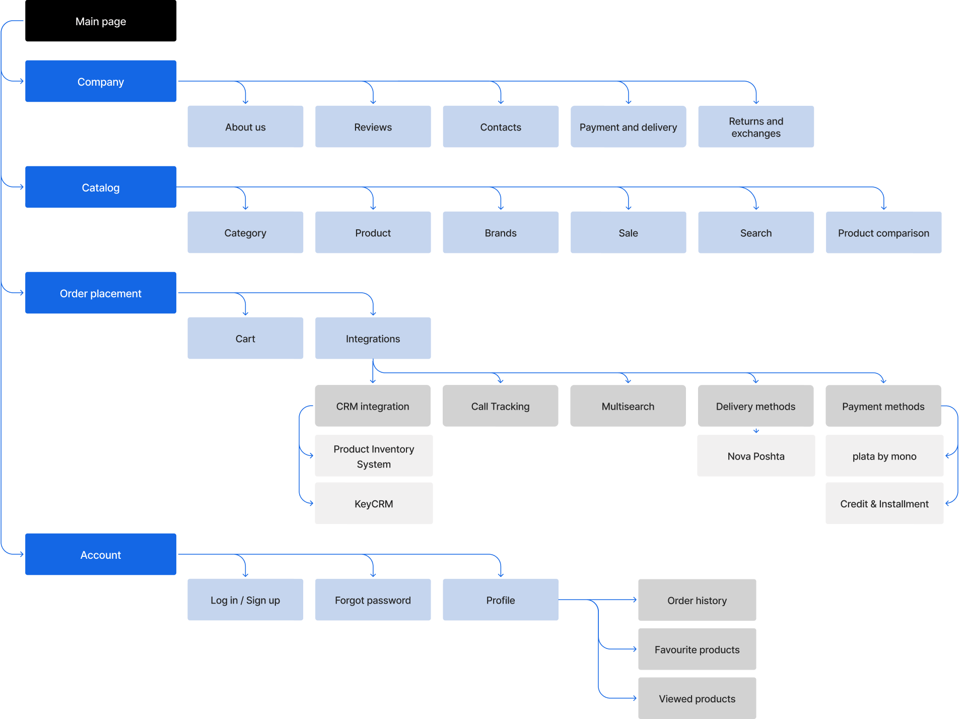
E-commerce structure
Logo design
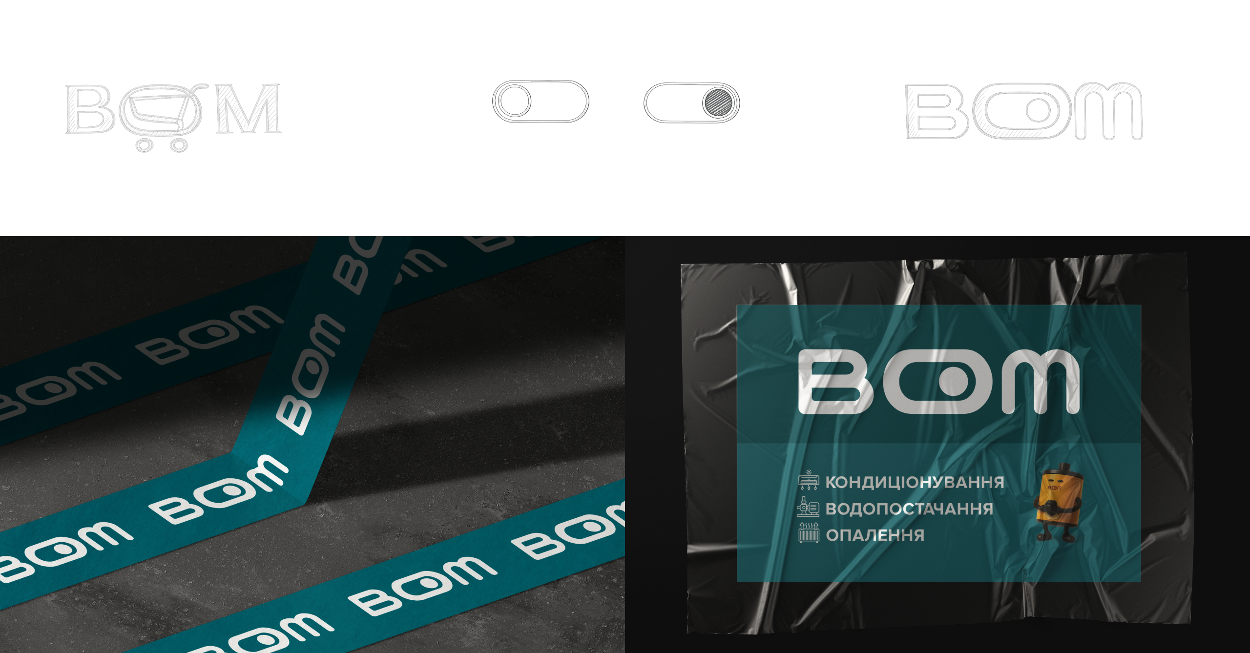
When creating the identity for BOM, we followed a clear client request – a text-based logo, but with a distinctive “twist.”
We initially explored the idea of combining one of the letters with a shopping cart symbol to highlight the e-commerce direction. However, after several iterations, it became clear that this approach felt too literal – we wanted something more – an element that is not only recognizable but also creates its own association.
So we shifted the focus to the essence of the business – the store deals with equipment: heating, ventilation, and air conditioning – everything that comes to life with the push of a button. This moment of “powering on” became the key concept – we integrated a power on/off symbol into the central letter O, turning it into a visual accent that is both intuitively readable and meaningful.
As a result, the logo achieved clean geometry, a technological character, and clear symbolism.
Colors
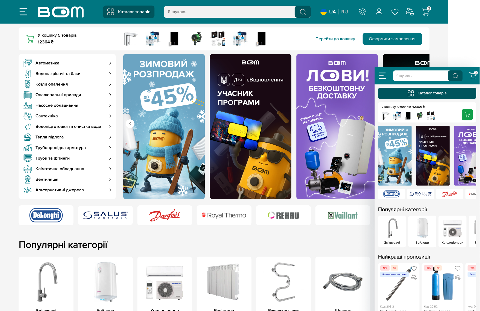
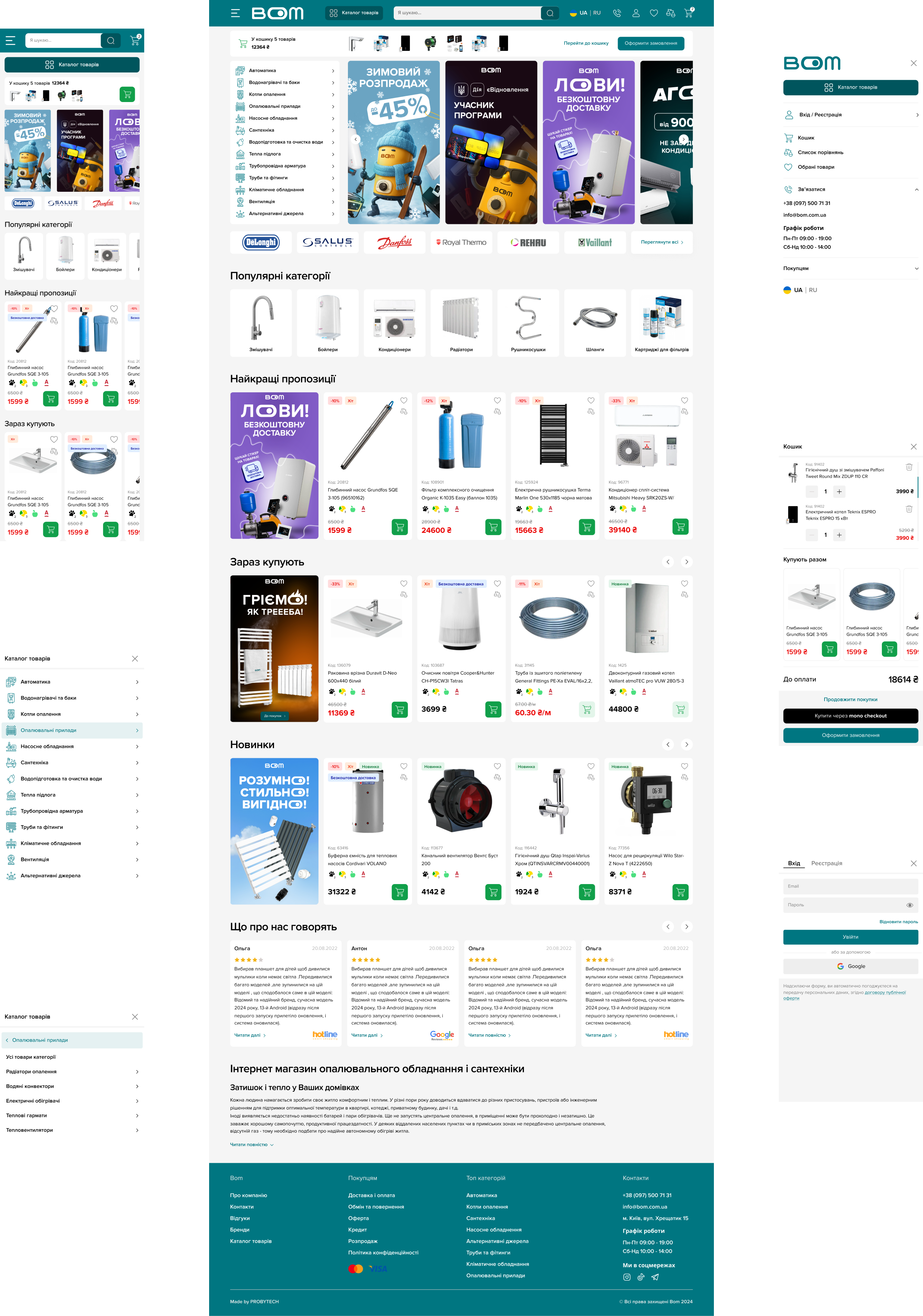
The client provided a preference for the primary color – #007681. Our team then developed a complete color system, selecting a light palette to create a clean, modern, and airy visual style.
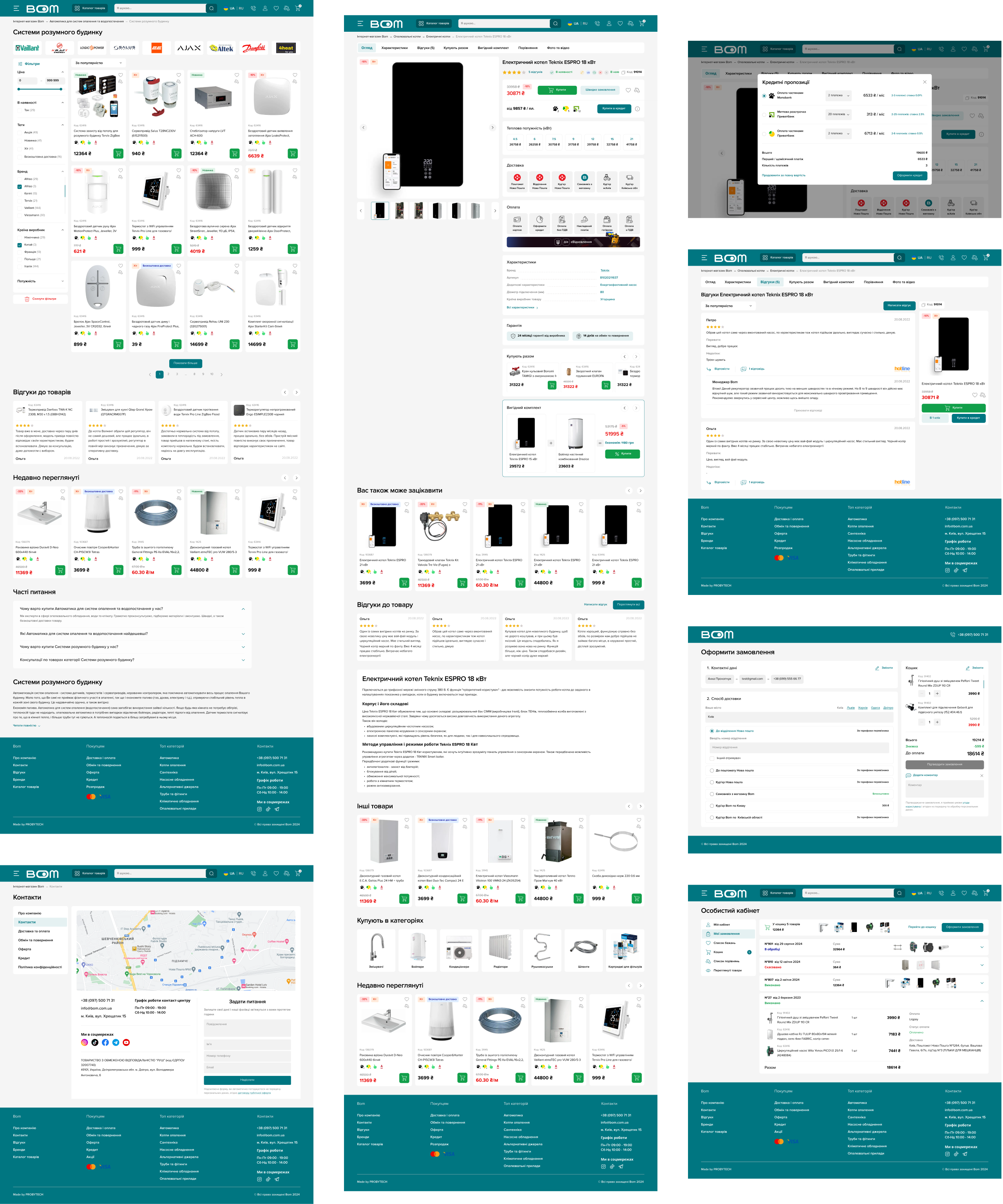
We integrated this accent color into key interface elements – buttons, active states, highlights, and icons – ensuring design consistency across all pages. For forms, cards, and buttons, we used soft rounding, making the interface visually friendlier and more contemporary.

Typography
We chose Proxima Nova as the primary font – a balanced, readable, and versatile typeface that works perfectly for an online store and supports the overall brand style.
The typography was designed with Tailwind CSS in mind, so font sizes were selected according to its class system. This helped maintain consistency between design and development and ensured correct text rendering across different devices.

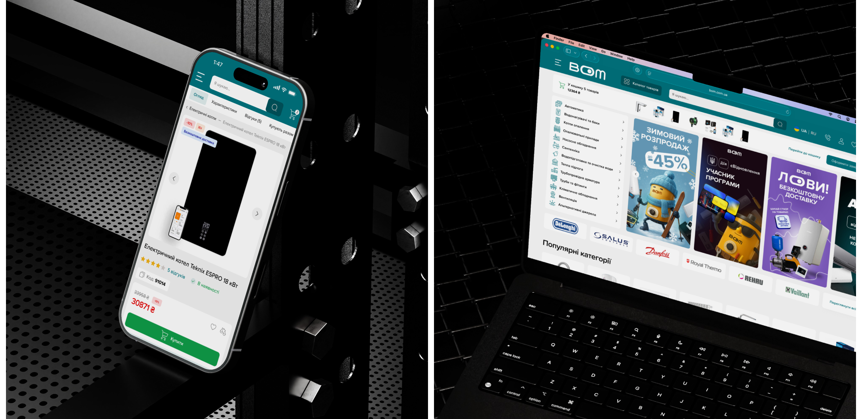
Main page
Other pages
E-commerce development
At the development stage, we first implemented all the core website functionality, creating a solid foundation for further integrations. Then we set up product import from the warehouse and order export to KeyCRM. After that, we connected delivery services, online payments, and telephony, providing a full-fledged infrastructure for sales.
Once the technical part was completed, we conducted comprehensive testing, fixed all possible issues, and prepared the project for launch. The collaboration did not end there: the team continued with technical support and took on SEO support.
In the course of further development, we integrated smart search, installment payments, and credit options. We also adapted the website to new business needs of the client: opening a physical store and integration with the “eVidnovlennia” government program.
The project continues to actively evolve – we regularly update the functionality, add new features, and optimize admin tools to speed up work with categories, products, and content.


